Blog Tips From a Non-Tech Blogger

I'm definitely not a blog expert. In fact, I only seem to get a post out every week or two. I know how to do a few things within Blogger and I have some good graphic software to help me make it look unique, but if something technical comes up, I either search the Internet or ask my techno-geek husband. So, honestly, I really don't know much.What I do know, is that there are a few things about blogs that bug me. I don't want to call them egregious errors. They're just small things that can be easily changed to make a blog more visually appealing...according to me.
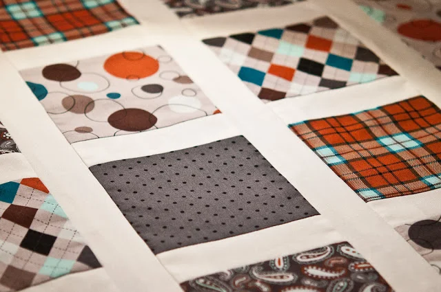
- Small photos. Photos are a huge part of blogging. We all want to think that our words are what draw followers, but honestly, I mainly look at the pictures. If I can't see what's in your photo, I'm less likely to read the words. Typically, I think photos should be sized Large or Extra-Large. If your column is too small to accommodate a bigger photo, change it.
- Hard to read fonts. If you are blogging, you obviously want others to read what you have to say. Fancy or handwritten fonts are...plain and simple...hard to read. Be very choosy with your font, its size AND its color. Make it easy for your reader. Dark text is easier to read. Fancy/Handwritten fonts usually need to be larger than simple fonts. Use something simple for the body of text and keep the fancy fonts for the title of the blog post.
- Narrow page. Sometimes I wonder if we pay too much attention to a blog's background. While the background helps to distinguish one blog from another, we follow a blog for its content, not for its cute background. The main page should be the focus. The background is just a pretty frame.
- Too wide sidebars. Sidebars are a fun place to add gadgets, buttons and other information about our selves but they shouldn't compete with the main column. You know, where all the good stuff is! They should by only about one-third the size of the main posting column. And again, decreasing the sidebar will allow for a bigger photo.
These are just a few ideas I've been kicking around. I hope you find them helpful. Now, I need to get a quilt done so I'll have something to blog about.